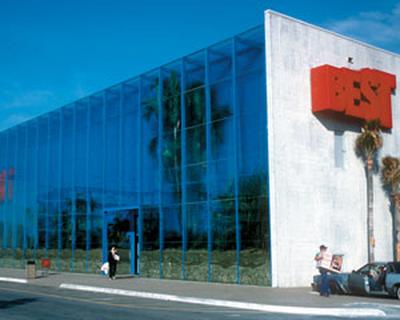
BEST Products showrooms
Contents |
[edit] Introduction
In the 1970s, the American retail sector witnessed the emergence of large, discount shopping outlets also known as big box stores or megastores. It was during this period that Sydney and Frances Lewis - owners of the BEST Products chain of catalogue stores - approached the architecture and design firm SITE (originally also known as Sculpture in the Environment) to design a series of showrooms.
The family gave full creative control of the project to SITE and its founder, James Wines. The resulting nine showrooms for the discount merchant became some of the most iconic structures of American postmodernist architecture.
[edit] Shopping with a special flair
Following the philosophy of architect and theorist Robert Venturi, Wines and his team embraced the idea that buildings should seek to accommodate local conditions of neighbourhood and public behaviour. Wines even went so far as to say buildings should be seen as entertainment, art, sculpture or even as a roadside event (as the BEST Products showrooms would prove to be).
To hear Wines discuss BEST Products showrooms and other facets of his design ideology, view this video.
Like other postmodern buildings, the BEST showrooms were characterised by their highly decorative, whimsical and kitsch aesthetic; above all refusing to draw inspiration solely from a single source, and often focussing on form over function. They also had a metaphoric nature, with structural designs based non-architectural forms .
In working on the showrooms, Wines adopted the idea that the building process itself was more inherently interesting than the finished product. Each of the nine showrooms broke away from the rigid formalities of modernism and began to incorporate stylistic references that were often playful and symbolic, using shape, broken edges and trompe l’oeil, and applying unconventional elements and structural inside-out references.
[edit] Outside the box
As with most big box outlets, each of the SITE-designed BEST showrooms would be shaped like a simple box, but the individual storefronts themselves would be very different, with some taking dramatic steps to adapt to the specifics of the location.
One example of this inventive design approach is the Indeterminate Facade BEST showroom in Houston, Texas. The uppermost edge of the structure is broken away to appear rough and unfinished. Above the store entrance, a deep cut in the crumbling wall reveals hundreds of white bricks that cascade onto a protective canopy. It is said that the image of this store was one of the most commonly-used photographs in books that covered 20th century architecture.
Some other storefront examples include:
- The Inside Outside Facade in Miami, Florida and Milwaukee, Wisconsin: a broken away wall reveals a false store interior.
- The Rainforest Building in Hialeah, Florida: a thriving rainforest is enclosed in a water wall terrarium that faces outward to the street.
- The Tilt Building in Towson, Maryland: its sharply angled facade caused more than one shopper to wonder how easy it would be to enter the store.
- The Forest Showroom in Richmond, Virginia - the entrance is cut away to accommodate the forest inside the building.
BEST Showroom Rainforest Building in Hialeah, Florida
[edit] Visual success, but commercial failure
Despite the founders’ strong marketing reputation (in its heyday, the company was the second most successful catalogue retailer in the United States), BEST Products went out of business in 1997. Since that time, the structures designed by SITE have either been demolished or their iconic facades removed - with one exception: the Forest Showroom in Richmond, Virginia. This structure has been home to the West End Presbyterian Church since 2000. The forest continues to thrive inside the entrance, and it is considered an asset to the building.
[edit] Related articles on Designing Buildings Wiki
- American architecture and construction
- Architectural styles.
- Deconstructivism.
- Demolishing Modernism: Britain's lost post-war gems.
- Futurist architecture.
- Modern building.
- Modernist architecture.
- Neo-futurism.
- Postmodern architecture.
- Retail buildings.
- Unusual buildings.
[edit] External references
- Dezeen, “Design in Dialogue: James Wines Talk with Friedman Benda VDF”.
- Failed Architecture, “The Ironic Loss of the Postmodern BEST Store Facades” by Margaret McCormick.
- SITE, “BEST Products Iconic Buildings”.
Featured articles and news
The history of building regulations
A story of belated action in response to crisis.
Moisture, fire safety and emerging trends in living walls
How wet is your wall?
Current policy explained and newly published consultation by the UK and Welsh Governments.
British architecture 1919–39. Book review.
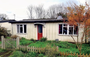
Conservation of listed prefabs in Moseley.
Energy industry calls for urgent reform.
Heritage staff wellbeing at work survey.
A five minute introduction.
50th Golden anniversary ECA Edmundson apprentice award
Showcasing the very best electrotechnical and engineering services for half a century.
Welsh government consults on HRBs and reg changes
Seeking feedback on a new regulatory regime and a broad range of issues.
CIOB Client Guide (2nd edition) March 2025
Free download covering statutory dutyholder roles under the Building Safety Act and much more.
AI and automation in 3D modelling and spatial design
Can almost half of design development tasks be automated?
Minister quizzed, as responsibility transfers to MHCLG and BSR publishes new building control guidance.
UK environmental regulations reform 2025
Amid wider new approaches to ensure regulators and regulation support growth.
The maintenance challenge of tenements.
BSRIA Statutory Compliance Inspection Checklist
BG80/2025 now significantly updated to include requirements related to important changes in legislation.


