About Mijimay123
Nothing
ELEMENTS OF DESIGNPOINT• The two ends of a line• The intersection of two lines• The meeting of lines at thecorner of a plane or volume• The center of a field
THE LOUVRE, PARIS
PANTHEON, ROM
ELEMENTS OF DESIGNLINEA point extended becomes aline with the properties of:• Length• Direction• Position
VITRA FIRE STATION – ZAHA HADID
DESIGN PLANE A line extended becomes aplane with the properties of:• Length and width• Shape• Surface• Orientation• Position
DAVAO INTERNATIONAL AIRPORTLEANDRO LOCSIN
DESIGN VOLUME plane extended becomes avolume with the properties of:• Length, width, depth• Form and space• Surface• Orientation• Position
CULTURAL CENTRE OF THE PHILIPPINESLEANDRO LOCSIN
VISUAL PROPERTIES OF FORM
SHAPE – configuration of a form’s surfaces and edges
SIZE – the real dimensions of form (length, width and d
COLOR – The hue, intensity, and total value of a form’s surface
POSITION – form’s location
ORIENTATION – cardinal points
SPATIAL TENSION – this type of
relationship requires that the two forms be relatively closeto each other, or share a common visual trait such asshape, material or color.
THE TRANSFORMATION OF FORM
3. ADDITIVE FORMS 4 BASIC POSSIBILITIES FOR TWO FORMS TO GROUP TOGETHER:
FACE TO FACE CONTACT – this type of
relationship requires the two forms to have flat, planarsurfaces that are parallel to each othe
CENTRALIZED FORMS – consist of number of secondary forms clusteredabout dominant, central, parent forms
INTERLOCKING
VOLUMES – in this type of
relationship, two forms
interpenetrate each other’s
space
LINEAR FORMS – consist
of forms arranged sequentiallyin a row
RADIAL FORMS – are
compositions of linear forms that extendoutward from central forms in a radialmanner
CLUSTERED FORMS – consist of
forms that are grouped together by proximity or thesharing of a common visual trait
GRID FORMS – modular forms whose relationships
are regulated by three-dimensional girds
ARTICULATION OF FORM
Articulation refers to the manner in which the surfaces of aform come together to define its shape and volume
SURFACE
A. TEXTURE
- Refers to the quality
of surface treatment
. TONE – variety in the use of the gradations from black to white. “Light and Shade”
. COLOR – the warmer climates have usually produced the most colorful archit
Point
A point has no dimension. To visibly mark a position in space or on theground plane, a point must be projected vertically into a linear form, as a column,obelisk, or tower. Any such columnar element is seen in plan as a point andtherefore retains the visual characteristics of a point.
.
As the prime element in the vocabulary ofform, a point can serve to mark:
§ The two ends of a line;§ the intersection of two lines; meeting of§ the lines at the corner of a plane orvolume; and
§ the center of a field.
It marks a position in space. Conceptually, it has no length, width, or
depth, and is therefore static,centralized, and directionless.A point has no shape or form. It is static in natu
Line
It is simply an extended point. Conceptually, a line has length, butno width or depth. It is capable of visually expressing direction, movement, andgrowth.
A line can serve to:§ join, support, surround, or intersect othervisual elements;
§ describe the edges of and give shape toplanes; and
§ articulate the surfaces of plane
LINEAR ELEMENTS
Vertical linear elements, such as columns, obelisks, and towers ,have been used throughout history to commemorate significant events andestablish particular points in space
Linear members that possess thenecessary material strength canperform structural functions.
In these examples, linear elements:
§ express movement across space;
§ provide support for an overheadplane; and
§ form a three-dimensional structural§ frame for architectural space.
PLANE
An extended line in a direction other than its intrinsic direction.
Conceptually, a plane has length and width, but no
Shape is the preliminary identifyingcharacteristic of a plane. It is determinedby the contour of the line forming theedges of a plane.
The supplementary properties of a plane-its surface, color, pattern, and texture -affect its visual weight and stability
PLANAR Element
I n a r c h i t e c t u r a l d e s i g n , w e
manipulate three generic types of planes:
§ Overhead plane , which can be either the roofor the ceiling plane;
§ Wall plane; and the
§ Base plane, which can be either the ground orfloor plane.
Volume
A plane extended in a direction other than its intrinsic direction.Conceptually, a volume has three dimensions: length, width, and
A volume can be either
- A solid
- A space displaced by mass;
A void space contained orenclosed by planes
VOLUMETRIC
A volume can be either :A solid ;A space displaced by mass;
A void space contained orenclosed by planes
FORM
The formal structure of a work—the manner of arranging andcoordinating the elements and parts of a composition so as to produce acoherent image.
§ Shape - The characteristic outline or surface configuration of a particularform. Shape is the principal aspect by which we identify and categorizeforms.
§ Size - The physical dimensions of length, width and depth of a form. Whilethese dimensions determine the proportion of form, its scale is detrmined byits size relative to other forms in its context.
§ Color - A phenomenin of light and visual perception that may be describedin terms that may be described in terms of individual perception of hue,saturation, and tonal value. Color is the attribute that most clearlydistinguishes a form from its environment . it also affectts the visual weight ofa from.
§ Texture - The visual and especially tactile quality given to a surface by thesize, shape, arrangement, and proportions of the parts. Texture alsodetermined the degre to which the surfaces of a form reflect or absorbincident light.
Relatoional
TOA 1 : ELEMENTS OF ARCHITECTURAL DESIGN 20
POSITION
The location of a formrelative to its environmentor the visual field withinwhich it is seen.
ORIENTATION
The direction of a formrelative to the groundplane, the compass points,other forms, or to theperson viewing the form.
VISUAL INERTIA
The degree of concentrationand stability of a form. Thev i s u a l i n e r t i a o f a f o r mdepends on its geometry aswell as its orientation relativeto the ground plane, the pullof gravity, and our line of sight.
Ooooollllstop
SHAPE
The characteristic outline orsurface configuration of aparticular form.
SHAPE
The characteristic outline or surface configuration of a particular form
SIZE
The physical dimensions of length, width, and depth of a form.While these dimensions determine the proportions of a form, its scale isdetermined by its size relative to other forms in its conte
TEXTURE
The visual and especially tactile quality given to a surface by thesize, shape, arrangement, and proportions of the parts. Texture also determinesthe degree to which the surfaces of a form reflect or absorb incident
COLOR
A phenomenon of light and visual perception that may be
described in terms of an individual’s perception of hue, saturation, and tonalvalue.
Color is the attribute that most clearly distinguishes a form from itsenvironment. It also affects the visual weight of a form
Hue: another word for color
- Value
- describes how light ordark the color is
- Temperature
- relates to thefeeling of warmth or coolnessthe color evokes; and
Intensity: measures the range ofa color from dull to vivid. Alsocalled chroma and saturation
COLOR WHEEL
Primary: red, blue,and yellow
Secondary: violet,green, and orange.
Tertiary: red-violet,blue-violet, yellow-green,blue-green, red-orange,and yellow-orange.
Psychological effect of color
Various color have ffects on emotional aspect on people. It reflects
the spirit of people who create it. Color s definitely related to the lives ofindividuals and the material things with which they are associated
RED
tends to produce range or passion
Yellow
Denotes Gayety; stimulatingcheering - to lazy, upsetting to the nervo
ORANGE
Has stimulating effect andshould usulally be used in relatively smallamounts.
BROWN
- is restful and warming but shouldbe combined with orange, yellow or goldbecause it could be depressing if usedalone
GRAY-
- suggest cold and is also depressingunless combined with at lest one liveliercolor.
WHITE
is cheerful, parucularly when usedwith warm colors like red, yellow andorange.
PURPLE
is seadative and soothing. Itsuggest a stately or melancholyatmosphere. Cheerfulness or cowardice,cheapness.
BLUE
is peaceful and tranquil.
GREEN
has a cooling quality and it acts asa sedative
Warm colors: exhibit energya n d j o y ( b e s t f o r p e r s o n a lmessages). They have a tendencyto appear larger.
C o o l c o l o r s : c o n v e ycalmness and peace (best foroffice use). They have a tendencyto appear smaller next to a warmcolor. They often work well as abackground color.
Basic color scheme
Complementary
Any two colors opposite each other on thewheel. For example, blue and orange.
Split complementary
Use three colors. The scheme takes onecolor and matches it with the two colorsadjacent to its complementary color. Forexample, blue, yellow-orange and red-orange.
Analogous
Any three colors next to each other on thewheel. For example, orange, yellow-orange,and yellow.
Triadic
Any three colors that are equallyapart on the color wheel. For example, red,yellow and blue.
Tetradic or Double complementary
Uses four colors together, in theform of two sets of complementary colors.For example, blue and orange is paired withyellow and violet.
Tints: come from adding white to hues;Shades: come from adding black to hues;Tones : mixing the hue with grey.Achromatic: use no color, just shades of grey, black and white. Also known asgreyscale.
Hue: Another name for colo
Chroma: Intensity or saturation of col
Value: The lightness or darkness of a col
Tint: Color + WhiteShade: Color + Black
Tone: Color + Grey
Key Color: Dominant color in a color scheme or mixture.
A Color Scheme is a combination of colors thatharmonize with each other.• Mono-chromatic: Using one color• Complimentary: Using two colors • Analogous: Using three colors that are
neighboring each other
• Triadic: Using three colors that are equal in
distance apa
PRINCIPLES OF COMPOSITION
1. Contrast
2. Proportion
3. Scale
4. Balance
5. Rhythm
6. Unity
7. Character
Our physical impressions are made possible through contrastSilence and soundCold and smooth : warm and roughLight and dark
1. CONTRAST OF MASS Combination of rectangular masses based upon contemporary practice
2. CONTRAST OF DIRECTION Horizontal and vertical direc
3. CONTRAST OF CHARACTER Showing different functions within a building by means of contrast in design
4. CONTRAST OF TREATMENT Same material used in different treatment
PROPORTION
Proportion is largely a matter of relationships.Comparison which the eye makes between the size, shape, and tone of an object
The Golden Section – line that is divided suchThat the lesser portion is to the greater as theGreater is to be the whole
The Vitruvian Man
By Leonardo Da Vinci in 1490
“The proportions of the humanbody according to Vitruvius”
SCALE
Scale is a fixed proportion used in determining measurements and dimensions.Scale has reference to proportions which are good for humans.
BALANCE
Balance is equality
It is a foundation upon which arrangement,harmony and adjustment of weights, tones,values are developed.
AXIS The most elementary means of organizing forms and spaces in architecture. It is a line established bytwo points in space and about which forms and spaces can be arranged in a regular or irregularmanner. Although imaginary and not visible, an axis is a powerful, dominating, regulating device.Although it implies symmetry. It demands BALANCE .
Unsymmetrical or occult balance is more subtle and elusive, and is more difficult to attain. It attempts to satisfy theeye without any effort to place equal masses at similar distances from the center of the composition. It is thegrouping, in an informal manner, of elements of varying sizes and shapes.
RHYTHM
Movement.Repetition.Spacing.
UNITY
Unity suggests harmony. If a structure has unity, it must have contrast, rhythm and scale.To have harmony, all the unrelated parts of an architectural arrangement are brought into properrelation.
CHARACTER
The elements of character grows out of the function of the building and the consideration of allthe creative principles of composition.
1. Function
2. Association
3. Personality
FUNCTIONAL CHARACTER
• The most important kind of character in architecture• Purpose of the building and the reason for its erection
ASSOCIATED CHARACTER
• By association and experience, we are able to distinguish between an Oriental, a Negro, aCaucasian, and an Indian man – similar manner in Architecture
PERSONAL CHARACTER
• Possess characteristics which have to do with the emotional reaction set up in the mind of theobserver.• Personality in a building has more to do with the spirit of the building than its purpose.
HUMAN FACTORS
SOCIOCULTURAL VARIABLES
1. PYSCHOLOGICAL CONSIDERATIONS2. PERSONAL SPACE3. PYSCHOLOGICAL AND SOCIAL SPAC
SOCIOLOGICAL VARIABLES
PEOPLE WITH DIFFERENT CULTURAL BACKGROUNDS VIEW ARCHITECTURAL FEATURES
DIFFERENTLY
1. ATTITUDE TOWARDS PRIVACY – BASED ON CULTURAL DIFFERENCES
2. FAMILY STRUCTURE – BASED ON SOCIAL STATUS
3. THE ROLE OF WOMEN – BASED ON RELIGION AND CULTURE
4. RECREATIONAL PATTERNS – BASED ON RECREATIONAL PURSUITS
5. SHOPPING HABITS
6. JOB PATTERNS – BASED ON DISTANCE OF WORK TO HOME
7. TECHNOLOGICAL EXPERIENCE – ADVANCEMENT IN TECHNOLOGI
SOCIOLOGICAL VARIABLES
PERSONAL SPACE
1. PUBLIC – FREEDOM OF ACCESS, BUT NOT OF ACTION
2. HOME – REGULAR FREEDOM OF BEHAVIOR
3. INTERACTIONAL – INVISIBLE BOUNDARY AND TERRITORIAL CLAIM
4. BODY – INVIOLATE TO THE INDIVIDUAL
PROXEMICS
the branch of knowledge that deals with the amount ofspace that people feel it necessary to set between
themselves and others.
PROXEMICS - 4 DISTANCE ZONES
A. INTIMATE DISTANCE –
“INVOLVEMENT WITH ANOTHER BODY”
A. CLOSE PHASE – ZERO DISTANCE
B. FAR PHASE – 0.15 TO 0.45M
B. PERSONAL DISTANCE – SEPARATEDBY BUBBLE OR SPHERE
A. CLOSE PHASE – 0.45 TO 0.75M
B. FAR PHASE – 0.75 TO 1.20M
C. SOCIAL DISTANCE – LIMIT OFDOMINATION
A. CLOSE PHASE – 1.20 TO 2.10M
B. FAR PHASE – 2.10 TO 3.60M
D. PUBLIC DISTANCE
A. CLOSE PHASE – 3.60 TO 7.50M
B. FAR PHASE – 7.50 + (9M IS THEAUTOMATIC DISTANCE SET FOR PUBLIC FIGURES
OTHER IMPORTANT TERMS
OTHER IMPORTANT TERMS
ANTROPOMORPHIC PROPORTIONS – systems based on the dimension andproportions of human body
ANTHROPOCENTRISM – human being is the most important entity in the universe
ANTHROPOMETRICS – study of measurements of the human body
ANTHROPOMORPHISM – human qualities are associated with non-humanentities/events.
EKISTICS – concerns the science of human settlements, including regional, city,community planning and dwelling design
ERGONOMICS – applied science considering the human characteristics in designingdevice
JUXTAPOSITION – to put side by side or close together – to pose for a painting
SEMIOTICS – study of symbols
SEMANTICS – study of meanings
TECTONICS – art and science of shaping
ANTROPOMORPHIC PROPORTIONS – systems based on the dimension andproportions of human body (pg. 108
ANTHROPOCENTRISM – human being is the most important entity in the universe
ANTHROPOMETRICS – study of measurements of the human body
ANTHROPOMORPHISM – human qualities are associated with non-humanentities/events.
EKISTICS – concerns the science of human settlements, including regional, city,community planning and dwelling design.
ERGONOMICS – applied science considering the human characteristics in designingdevices
JUXTAPOSITION – to put side by side or closetogether – to pose for a painting. This is oftendone in order to compare/contrast the two, toshow similarities or differences
SEMANTICS – study of meaningsArchitectural semanticsMeaning is not only the first mental entity to come into consciousness, but that it isalso the entity which commonly inspires creative work. A memory image of anearlier perceived form changes in the direction of the nearest form. During thischange of the image, the subject also experiences a trend to add a meaning to whatwas originally a perception of a 'non-sensical form
SEMANTICS – study of meanings1. Signals and Signs Symbolic signa. Indexical sign, or Index
Something which had an existential relation between signifier and
b. The Iconic Signs - Concern a different set of relations between signifier andsignified although, of course, there is always present an existential andtherefore indexical relation as well. Most 'functional' architecture is of thissort: pie-shaped or wedge-shaped auditoria, tube-shaped circulationcorridors, structurally-shaped bridges, hot-dog stands in the shape of liotdogs, folkhouse with a facade that looks like a real fireplace. And the use offorms and materials according to their inherent emotional overtones 'red as
aggressive; passionate etc
c. Symbolic sign – Where conventional usagesets the arbitrary relation between signifier
and signified.
Conventional use of three orders of classicalarchitecture (Doric for banks etc.masculine).
A symbol is a sign which refers to the object thatit denotes by virtue of law, usually anyassociation of general ideas, which operatesto cause that symbol to be interpreted as
referring to that object
2. Symbols – For a human being, the meaning of an object in addition, appearinstead of another meaning. as a symbol of the latter. The simplest way ofunderstanding what this means is possibly to imagine that one is making asymbolical representation of a mechanical, electrical, circuit plan or plumbing
device of a building
3 . Expression – Both signals and symbols must be distinguished from a third kind ofmeaning, namely expression. If a face has an angry expression, this does notimply that a person entertains an emotional complex for which he exhibits asymbol. The angry facial expression forms a part of the physical and mental
totality which the angry person represents. In a similar manner theARCHITECTURAL EXPRESSION forms a part. as the semantic active component inthe mental totality, which the experience of a consummate piece of architectureinvolves. Architectural expression, however is not the same as the expression ofan emotion.
Contrast
Contrast create visual variety,excitement and interest to thebuilding and can be achieved by:
using different sizes;
different material, texture, andcolors; or
manipulating the light, shade,and shadow of masses.
Types of Contrast
CONTRAST OF FORM
§ CONTRAST OF LINE
§ CONTRAST OF SIZe
§ CONTRAST OF TONe
CONTRAST OFFORM
ARC DE TRIOMPH
PARIS FRANCE
I n o r d e r f o r a s h a p e t o b eintresting there must be a varietyor contrast. Square and circularareas may create diversifiedinterest.
CONTRAST OFLINE
PHILHARMONIE LUXEMBOURG
LUXEMBOURG CITY,
Christian de Portzamparc
Line may offer contrast onaccount of it change in type orcharacter. It may be curved orstraight, regular or irregular,broken or continuous.
CONTRASTOF SIZE
VITRA HAUS
Weil am Rhein, Germany
Herzog and de Meuron
Deals with objects whichmay have the same shapeand direction but may varyin size. If this change in sizeis gradual and uniform, theresult is called gradation.
CONTRASTOF TONE
MODERN BAHAY NABATO
Contrast was shownbetween the roof andwalls of the house. Andthe different materialsused in ground floor wallsfrom the second floorwalls.
PROPORTION
The proper harmonious relation of one part to another or to the whole.
Relative
The relative size of two quantitiesexpressed as the quotient of one divided by theother
Absolute
Deals with the relationship between thedifferent parts of an object or the whole to thevarious parts.
Proportioning system
§ They can visually unify the multiplicity ofelements in an architectural design by havingall of its parts belong to the same family ofproportions.
§ They can provide a sense of order in, andheighten the continuity of, a sequence ofspaces.
§ They can establish relationships betweenthe exterior and interior elements of a building
GOLDEN
SECTION
§ The Greeks recognized thedominating role the GoldenSection played in the proportions
of the human body.
§ Renaissance architects alsoexplored the Golden Section in
their work.
§ I n m o r e r e c e n t t i m e s , L eCorbusier based his Modulorsystem on the Golden Section
Parthenon
Athens, Greece. Ictinus andCallicrates.
The proportioning beginsby fitting the facade into aGolden Rectangle. Each analysisthen varies from the other in itsa p p r o a c h t o p r o v i n g t h eexistence of the Golden Sectionand its effect on the dimensionsand distribution of elementsacross the facade.
REGULATING LINES
If the diagonals of tworectangles are either parallel orperpendicular to each other, theyindicate that the two rectangleshave similar proportions. Thesediagonals, as well as lines thatindicate the common alignment ofelements, are called regulatinglines.
Classical orders
T o t h e G r e e k s a n dRomans of classical antiquity,the Orders represented in theirproportioning of elements the
perfect expression of beautyand harmony. The basic unit ofdimension was the diameter ofthe column .
§ Tuscan
§ Doric
§ Ionic
§ Corinthian
§ Composite
Renaissance Theories
The architects of the Renaissance,believing that their buildings had tobelong to a higher order, returned to the
Greek mathematical system ofproportions.
Seven Ideal Plan Shapes for Rooms.
Andrea Palladio (1508–1580) wasprobably the most influential architect of
the Italian Renaissance. In The FourBooks on Architecture, first publishedin Venice in 1570, he followed in thefootsteps of his predecessors, Albertiand Serlio, and proposed these seven“most beautiful and proportionablemanners of rooms. ”
Determining the Heights of Rooms.
Palladio also proposed several methodsfor determining the height of a room so
that it would be in proper proportion tothe room’s width and length.
Modulor
Le Corbusier developed thisproportioning system to order “thedimensions of that which containsand that which is contained.”
He based the Modulor on both
mathematics (the aesthetic dimensionsof the Golden Section and the FibonacciSeries), and the proportions of thehuman body (functional dimensions).
The basic grid consists of threemeasures, 113, 70, and 43 centimeters,proportioned according to the GoldenSectio
Ken
The ken was introduced in the latter halfof Japan’s Middle Ages.
Although it was originally used simply todesignate the interval between twocolumns and varied in size, the ken wassoon standardized for
residentialarchitecture
Anthropometry
Anthropometry refers to the measurement of the size andproportions of the human body.
It is predicated on the theory that formsand spaces in architecture are either
containers or extensions of the humanbody and should therefore bedetermined by its dimensions
Scale
The size of something compared to a referencestandard or to the size of something else.
Human Scale
Human scale in architecture is based onthe dimensions and proportions of thehuman body.
Balance
A state of equilibrium between contrasting, opposing,or interacting elements. Also the pleasing or
harmonious arrangement or proportion of parts orelements in a design or composition.
Symmetry
The exact correspondence in size, form, andarrangement of parts on opposite sides of a dividingline or plane, or about a center or axis
Bilateral
Refers to the balanced arrangement of similar orequivalent elements on opposite sides of a median axisso that only one plane can divide the whole intoessentially identical halves
Unity temple
Oak Park, Illinois. Frank Lloyd Wright.
Multiple symmetries, both major andminor, can add complexity and hierarchy
to a composition as well asaccommodate programmatic and
contextual requirements.
Radial symmetry
The balanced arrangement of similar, radiating elementssuch that the composition can be divided into similarhalves by passing a plane at any angle around acenterpoint or along a central axis
Hierarchy
The articulation of the importance or significance of aform or space by its size, shape, or placement relative
to the other forms and spaces of the organization
being important or significant to anorganization, it must be made uniquelyvisible.
This visual emphasis can be achieved byendowing a form or shape with:
exceptional size;
a unique shape;
ora strategic location
By size
A form or space may dominate anarchitectural composition by beingsignificantly different in size from all theother elements in the composition.
Normally, this dominance is made visibleby the sheer size of an element.
By shape
A form or space can be made visuallydominant and thus important by clearlydifferentiating its shape from that of theother elements in the composition. Adiscernible contrast in shape is critical,
whether the differentiation is based on achange in geometry or regularity
By placement
A form or space may be strategicallyplaced to call attention to itself as beingthe most important element in acomposition.
Rhythm
Movement characterized by a patterned repetition oralternation of formal elements or motifs in the same
or a modified form.
Repetition
The act or process of repeating formal elements ormotifs in a design.
The simplest form of repetition is alinear pattern of redundant elements.They may be grouped according to:
size;shape; ordetail characteristics
Form
The formal structure of a work—the manner ofarranging and coordinating the elements and parts of
a composition so as to produce a coherent ima
Articulation
A method or manner of jointing that makes the unitedparts clear, distinct, and precise in relation to each
other.
A form can be articulated by:
Change in material
, color, texture, or pattern;
Developing corners as distinct linear elements
- Removing corners; and
Lighting the form.
Relation properties of form
Position
The location of a form relative to itsenvironment or the visual field withinwhich it is seen.
Orientation
The direction of a form relative to theground plane, the compass points, otherforms, or to the person viewing the form
Hoffman house
The color, texture, and pattern ofsurfaces articulate the existence of
planes and influence the visual weight ofa form.
John deere
Linear patterns have the ability toemphasize the height or length of form,
unify its surfaces, and define its texturalquality.
The linear sun-shading devicesaccentuate the horizontality of thebuilding form.
Cbs building
New York. Eero Saarinen.
Linear columnar elements emphasizethe verticality of this high-rise structur
La Guade, Var, France. MarcelBreuer.
The three-dimensional form of theopenings creates a texture of light,Center shade, and shadow
Rochester New York. Louis Kahn.
The pattern of openings and cavitiesinterrupts the continuity of the exterior Church wall planes.
Einstien tower
Rounded corners express continuity ofsurface, compactness of volume, andsoftness of form.
Circulation
The passage of persons or things from one place toanother or through an area.
Since we move in time through a sequence ofspaces, we experience a space in relation to wherewe’ve been and where we anticipate going
Elements of circulation
Approach
Entrance
Configuration of the path
Path-space relationship
Approach
The distant view.
Prior to actually passing into the interior of a building,
we approach its entrance along a path. This is the firstphase of the circulation system, during which we areprepared to see, experience, and use the spaces withina building.
Kinds of approach
Frontal
Oblique
Spiral
Frontal
Leads directly to the entrance of abuilding along a straight, axial path .The visual goal that terminates theapproach is clear.
Oblique
Enhances the effect of perspective onthe front facade and form of a building
Spiral
Prolongs the sequence of the approachand emphasizes the three-dimensionalform of a building as we move around itsperimeter.
Entrance
From outside to inside
. Entering a building, a room within a building, or a
defined field of exterior space, involves the act ofpenetrating a vertical plane that distinguishes onespace from another and separates “here ” from“there.
Entrances may be grouped formally intothe following categories:
flush
- projected
- andrecesse
Flush
Maintains the continuity of the surfaceof a wall and can be deliberatelyobscured.
Projected
Forms a transitional space, announcesits function to the approach, andprovides overhead shelter
Recessed
Also provides shelter and receives aportion of exterior space into the realmof the building.
Configuration of path
The sequence of spaces.
All paths of movement are linear in nature. And allpaths have a starting point, from which we are takenthrough a sequence of spaces to our destination
Kinds of configuration
Linear
All paths are linear. A straight path,however, can be the primary organizingelement for a series of spaces. Inaddition, it can be curvilinear orsegmented, intersect other paths, havebranches, or form a loop
Radial
A radial configuration has linear pathsextending from r terminating at a central,common point.
Spiral
A spiral configuration is a single,continuous path that originates from acentral point, revolves around it, andbecomes increasingly distant from
Grid
A grid configuration consists of two setsof parallel paths that intersect at regularintervals and create square orrectangular fields of space.
Network
A network configuration consists ofpaths that connect established points inspace.
Path space relatinship
Edges, nodes, and terminations of the path.
Paths may be related to the spaces they link in thefollowing ways:
Pass by Spaces
Pass throughSpaces
Terminate in aSpace
Pass by spaces
The integrity of each space ismaintained; The configuration of the path isflexible; The mediating spaces can be usedto link the path with the spaces
Form of the circulation space
Corridors, halls, galleries, stairways, and rooms.
The form of a circulation space varies according to how:
its boundaries are defined;
its form relates to the form of the spaces it links; its qualities of scale, proportion, light, and view are
articulated;
entrances open onto it; and it handles changes in level with stairs and ramps
Enclosed
Forming a public galleria or privatecorridor that relates to the spaces it linksthrough entrances in a wall plane
Open on one side
Forming a balcony or gallery thatprovides visual and spatial continuitywith the spaces it links.
Open on both sides
Forming a colonnaded passageway thatbecomes a physical extension of thespace it passes through.
Featured articles and news
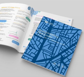
The Sustainability Pathfinder© Handbook
Built environment agency launches free Pathfinder© tool to help businesses progress sustainability strategies.
Government outcome to the late payment consultation, ECA reacts.
IHBC 2025 Gus Astley Student Award winners
Work on the role of hewing in UK historic conservation a win for Jack Parker of Oxford Brookes University.
Future Homes Building Standards and plug-in solar
Parts F and L amendments, the availability of solar panels and industry responses.
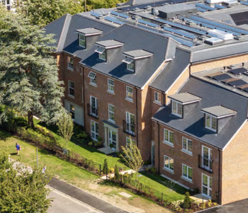
How later living housing can help solve the housing crisis
Unlocking homes, unlocking lives.
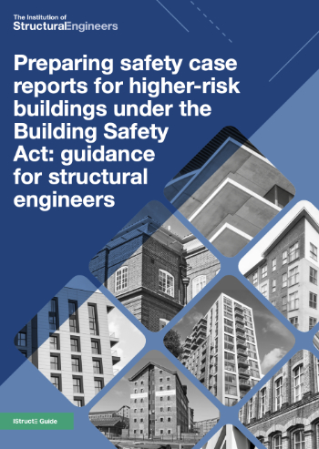
Preparing safety case reports for HRBs under the BSA
A new practical guide to preparing structural inputs for safety cases and safety case reports published by IStructE.
Male construction workers and prostate cancer
CIOB and Prostate Cancer UK encourage awareness of prostate cancer risks, and what to do about it.
The changed R&D tax landscape for Architects
Specialist gives a recap on tax changes for Research and Development, via the ACA newsletter.
Structured product data as a competitive advantage
NBS explain why accessible product data that works across digital systems is key.
Welsh retrofit workforce assessment
Welsh Government report confirms Wales faces major electrical skills shortage, warns ECA.
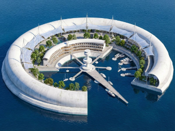
A now architectural practice looks back at its concept project for a sustainable oceanic settlement 25 years on.
Copyright and Artificial Intelligence
Government report and back track on copyright opt out for AI training but no clear preferred alternative as yet.
Embedding AI tools into architectural education
Beyond the render: LMU share how student led research is shaping the future of visualisation workflows.
Why document control still fails UK construction projects
A Chartered Quantity Surveyor explains what needs to change and how.
Inspiration for a new 2026 wave of Irish construction professionals.
New planning reforms and Warm Homes Bill
Take centre stage at UK Construction Week London.
A brief run down of changes intentions from April in an onwards.


